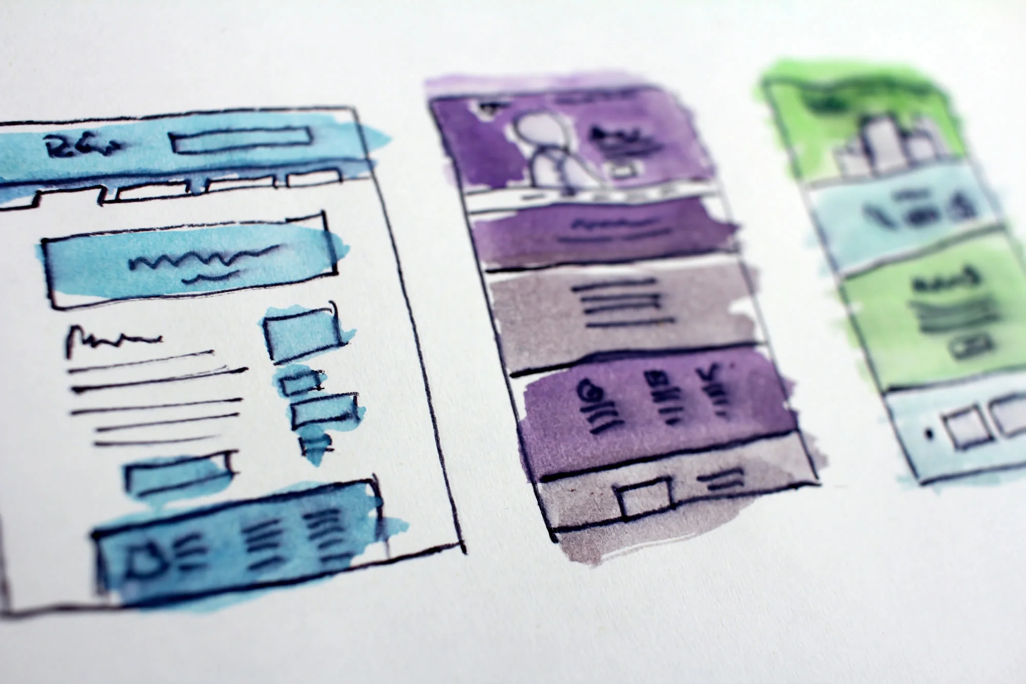
A one page website puts everything on a single scrolling page, with the menu jumping to sections instead of separate pages. Done well, it lets you control the story from top to bottom and keeps the message focused. It suits a product launch, an event, a new business with one clear offer, or a personal portfolio. Here’s how to tell whether it’s right for you, and five tips for designing one.
When is a one page website enough?
A one page website is enough when you have one audience, one main message and one action you want people to take. A new café, a conference, a single product or a freelancer with a focused offer can say everything they need in five or six sections.
It starts to hold you back when you offer several services, serve different audiences, or want to rank in search for a range of topics. Search engines rank pages, so one page has a limited number of searches it can be relevant for. If you expect to grow, plan the structure now so the single page can become a homepage later.
1. Put the essentials at the top
The first screen should say what you do, who it’s for and what to do next. Visitors shouldn’t have to scroll to find out whether they’re in the right place. A clear headline, one supporting sentence and a button are usually enough.
2. Keep it simple and in a logical order
Arrange the sections in the order a visitor’s questions come up: what is it, why should I care, how does it work, what does it cost, how do I get in touch. Break the content into distinct sections with clear headings and generous white space, so the page never turns into a wall of text.
3. Navigation still matters
A single page still needs a menu. Use anchor links in a header that stays visible as people scroll, so they can jump straight to pricing or contact details. Keep the labels short and make sure they work on a phone, where the menu will usually sit behind a toggle.
One page, one story, one action. If you need more than that, you need more than one page.
4. Use media with a purpose
Video, animation and good photography can make a one page site feel alive. Use them where they explain something, such as a short product demo, and keep file sizes down. A long page full of heavy media can load slowly on mobile, and autoplaying video with sound will send people away.
5. Don’t forget the call to action
By the bottom of the page a visitor has heard your whole pitch, so that’s where your strongest call to action belongs. Decide on the one next step, such as booking, buying or enquiring, and repeat the button at sensible points on the way down. A newsletter sign-up is a useful second option for people who aren’t ready yet.
How we approach this
We design one page sites for launches and focused businesses, and we’ll tell you honestly if your plans need a few more pages. You can see how we work on our web design services page.
FAQs
Is a one page website bad for SEO?
It’s limiting rather than bad. A single page can rank well for one focused topic, such as your business name and main service, but it can’t target many different searches the way separate pages can. If search is an important source of customers, a multi-page site usually performs better.
What should a one page website include?
A clear headline and call to action at the top, a short explanation of what you offer, proof such as testimonials, pricing or how to get started, and contact details. Add a sticky menu with anchor links so visitors can jump between sections.