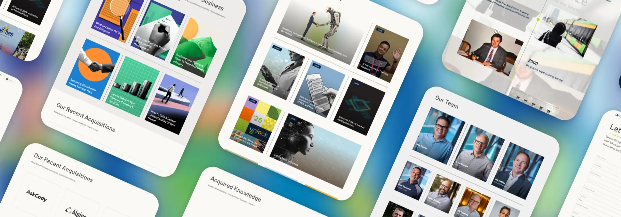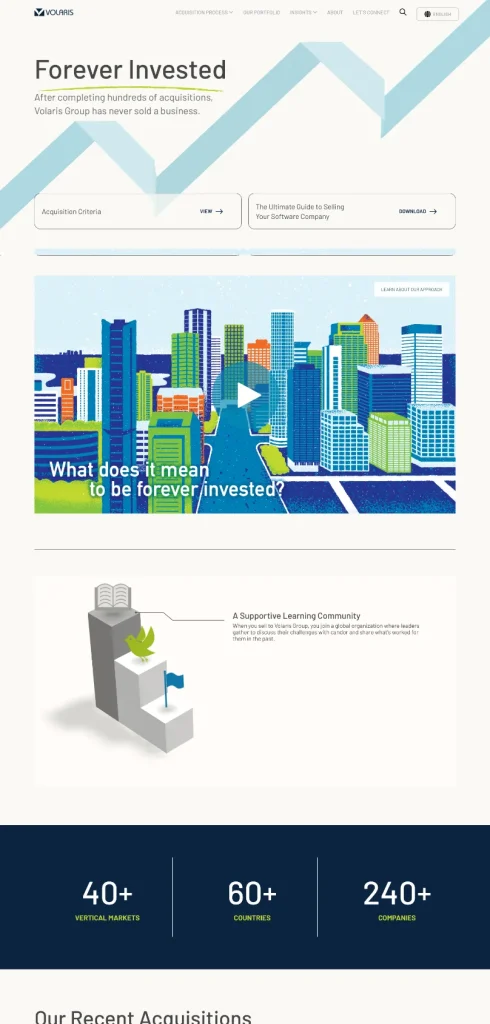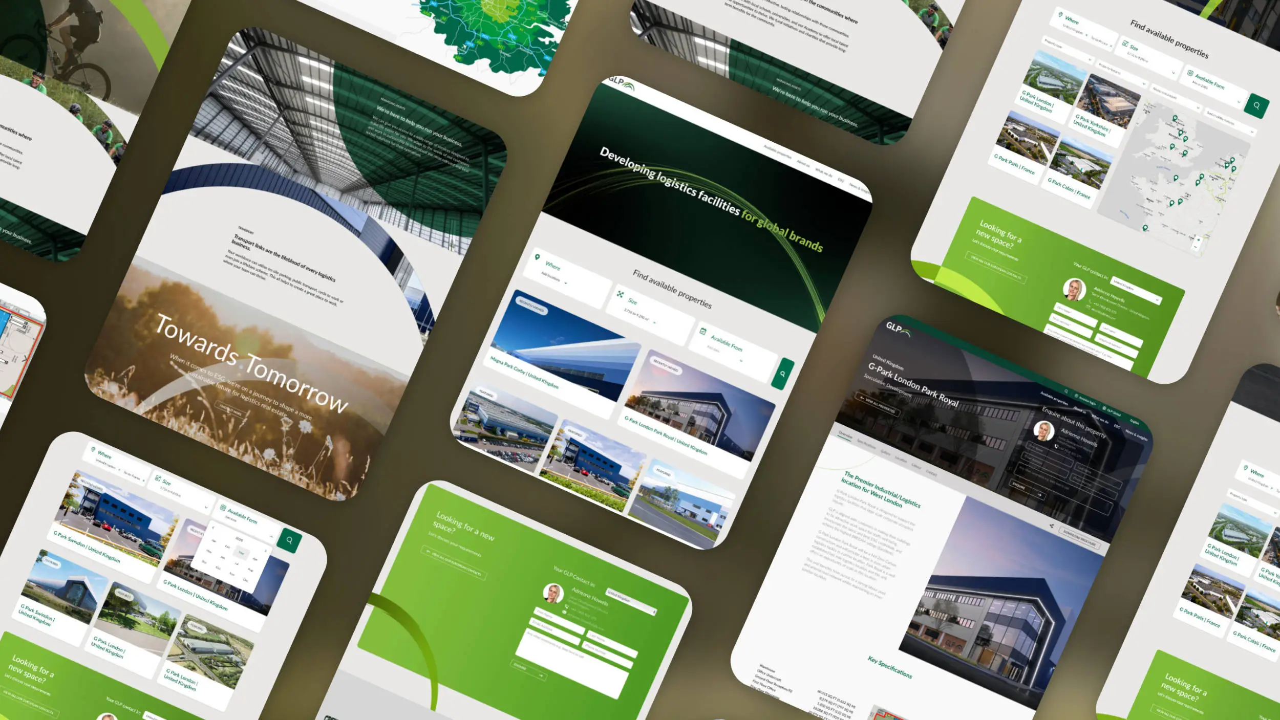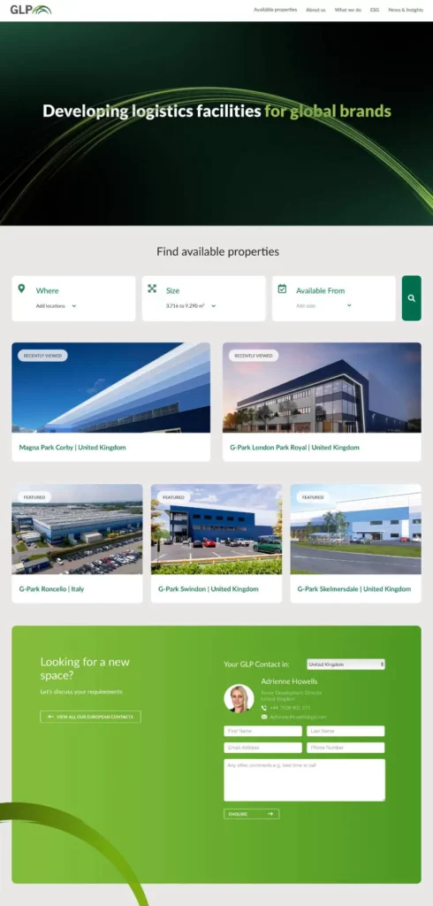
UI (user interface) design is everything a visitor sees and interacts with on your website: the layout, colours, type, buttons, forms and icons. UX (user experience) design is the whole experience of using the site, from finding the right page to completing a purchase or enquiry, and how easy or frustrating that feels. UI is about how the site looks and responds; UX is about whether it works for the person using it. A good website needs both.
For a business, the difference shows up in the numbers. A site with polished UI and poor UX looks impressive and loses people at the form. Here’s how the two fit together, and what to fix first.
What does UI and UX design mean?
Think of a train station. The UX is how the station is planned: where the entrances go, how you get from the ticket office to the right platform, how long the queue is. The UI is the signage, the departure boards and the ticket machine’s buttons. Brilliant signs can’t fix a station where the platforms are in the wrong place, and a well-planned station with unreadable signs still leaves people lost.
On a website, UX designers work on the structure: what pages exist, what’s on each one, the order of steps in a booking or checkout, and what happens when something goes wrong. UI designers turn that structure into an interface: the visual hierarchy, the components, the states of each button and field, and the consistency that makes the whole site feel like one product.
What is the difference between UI and UX?
The shortest answer: UX decides what should happen, and UI decides how it looks and feels when it does.
Take a hypothetical training company with a course booking page. The UX questions are about the journey. Does the visitor need to create an account before booking? How many fields are on the form? Can they see the price and dates before they commit? The UI questions are about the surface. Is the “Book your place” button the most visible thing on the page? Are the dates easy to scan? Does an error message appear next to the field that caused it, in words a person understands?
In small teams, one designer often does both. That’s fine, as long as both sets of questions get asked.
Why is good UX important for a business website?
Good UX turns visitors into customers without them noticing the effort. Every extra step, unclear label or slow page is a small reason to leave, and they add up. Good UX also cuts the cost of everything around the website: fewer support calls asking where something is, fewer abandoned forms, and paid traffic that converts instead of bouncing.
Back at the training company, say the booking page asks for an account, then a 14-field form, then shows the price on the final step. People drop off at each stage. A UX review might move the price and dates to the top, let people book as a guest and cut the form to name, email, phone and course date. The visual design barely changes. The booking rate is what moves.
Visitors don’t notice good UX. They just finish what they came to do, and that’s the point.
How can I improve the UX of my website?
Start with evidence, then fix the biggest problem first. These steps work for most business websites:
- Watch real people use it. Ask five people who match your customers to complete a key task while you watch and say nothing. Jakob Nielsen’s long-standing research suggests a handful of users is enough to find most of the serious usability problems.
- Read your analytics. In Google Analytics 4, look for pages with plenty of visits and few next steps, and for forms people start but don’t finish.
- Use session recordings and heatmaps. Tools like Microsoft Clarity (free) show where people click, scroll and hesitate.
- Cut steps. Remove form fields you don’t need, let people check out or enquire as a guest, and put the key information (price, timing, location) where people look first.
- Make navigation predictable. Plain menu labels such as “Services”, “Pricing” and “Contact”, and breadcrumbs on deeper sites.
- Write for skimmers. Most people scan before they read. Clear headings, short paragraphs and the answer before the detail.
- Design for everyone. Meet WCAG AA: 4.5:1 contrast for body text, every image described, every control usable by keyboard.
UI design tips that make a site easier to use
Good interfaces communicate without explanation. Visitors shouldn’t need to work out what’s clickable or what happens next. These are the habits our designers rely on:
- Use familiar patterns. People expect the logo to link home, the menu to sit at the top and the basket to be top right. Established UI patterns exist because they work. Save the originality for your brand and keep navigation familiar.
- Build a clear visual hierarchy. One primary action per screen, styled to stand out. Secondary actions look secondary.
- Be consistent. The same button style, spacing, colours and tone of voice on every page. A small design system of shared components keeps a growing site consistent.
- Show every state. Buttons need hover, focus, pressed and disabled states. Forms need clear error and success messages.
- Give things room. White space groups related items and makes the important ones easier to find.
- Look widely for ideas. Good designers keep a library of interfaces they admire, and study why they work before borrowing from them.
Is AI replacing UI/UX designers?
No, though it’s changing how they work. AI tools can now generate layout options, write placeholder copy, summarise user research and speed up prototyping, which frees designers to spend more time on the parts AI does badly: understanding a specific business and its customers, making judgement calls about trade-offs, and testing with real people. A design generated in seconds still needs someone to decide whether it’s right for your customers, and to prove it.
How we approach UI and UX at Blue Flamingo
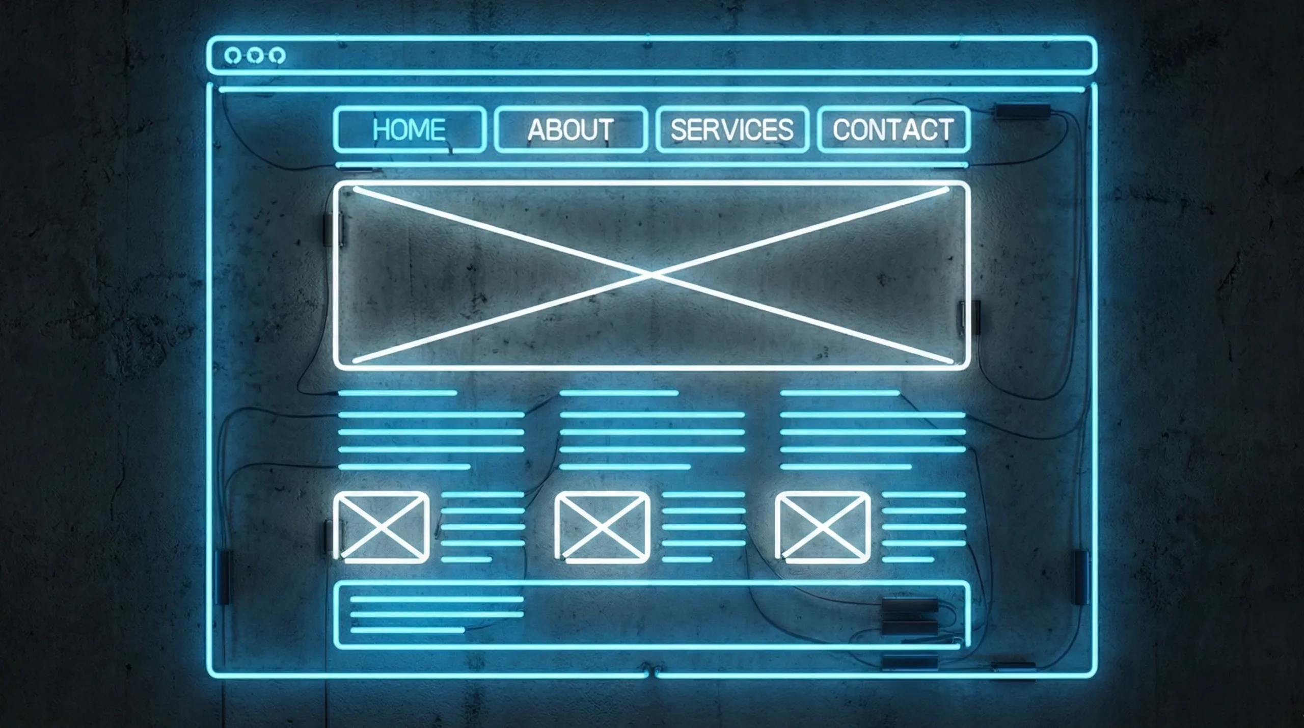
Our projects start with a discovery workshop about your customers and what they need to do on the site, then move through wireframes and a clickable prototype before anything is styled. That way the UX is agreed first and the UI is designed around it, by our in-house team. You can see how a project runs on our web design services in London page.
FAQs
What does UI and UX design mean?
UI design (user interface) covers everything people see and interact with on a website: layout, colours, typography, buttons and forms. UX design (user experience) covers the whole journey of using the site, including how easy it is to find information and complete tasks. Together they decide whether a website looks right and works for the people using it.
What is the difference between UI and UX?
UX decides what should happen on a website: the pages, the steps and the flow of a task like booking or buying. UI decides how that looks and feels: the visual design of each screen, button and form. A site can have attractive UI and still frustrate people if the UX underneath is poor.
How can I improve the UX of my website?
Watch a few real customers try to complete a key task, then check your analytics for pages and forms where people drop off. Fix the biggest problem first, usually by cutting steps, simplifying forms, putting key information where people look first and making navigation labels plain and predictable.
Is AI replacing UI/UX designers?
No. AI tools speed up parts of the work, such as generating layout ideas and summarising research, but they can’t understand a particular business and its customers or test designs with real people. Designers who use AI well spend more of their time on those judgement calls.