Choosing the right colours for a website goes beyond mere aesthetics and delves into the realm of psychology. The colours used can profoundly influence how users perceive a brand, interact with the site, and eventually convert into customers. Understanding the psychology of colour in web design is essential for creating user-centric, impactful websites. For any business, especially in a competitive market like London, partnering with a skilled website design agency in London ensures colour choices align with strategic goals and brand identity.
Why Colour Matters in Web Design
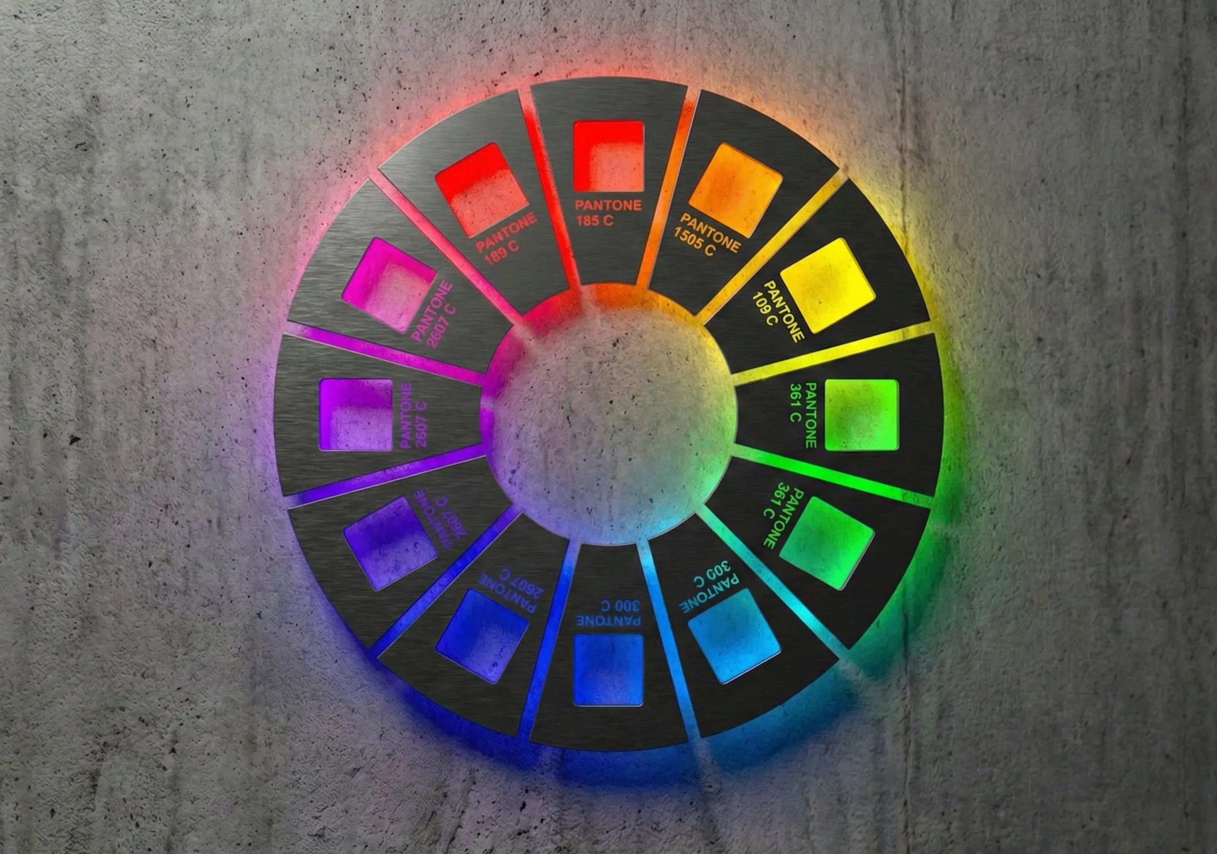
Colours evoke emotions and communicate messages, setting the tone for a brand, creating trust and influencing user behaviour. Blue is often associated with trust and dependability, making it a popular choice for banks and tech companies. Red evokes urgency and excitement, often used in sales or call-to-action buttons. Green symbolizes growth, health and tranquillity, making it perfect for eco-friendly brands or wellness websites. When used thoughtfully, colour can guide users through a website, highlight key elements, and reinforce brand identity.
The Psychology of Key Colours
Blue: Trust and Dependability
Blue promotes calmness and security, making it ideal for professional services, technology companies, and healthcare websites. Pairing blue with contrasting accent colours helps avoid monotony.
Red: Passion and Urgency
Red stimulates excitement and action, making it effective for e-commerce websites to highlight sales or promotions, though it should be used sparingly to avoid overwhelming users.
Green: Harmony and Growth
Green symbolizes nature, health and prosperity and is common in sustainability brands, financial services, and wellness platforms. Pairing lighter greens with neutral tones can create a modern, clean look.
Yellow: Optimism and Energy
Yellow radiates positivity and draws attention, suitable for brands targeting youthful or creative audiences, though excessive use can cause eye strain.
Black: Elegance and Sophistication
Black exudes luxury and power, making it suitable for high-end product websites, fashion brands, or photography portfolios. Using black backgrounds with lighter text can create a sleek, professional feel.
Balancing Psychology and Brand Identity Through Colours
A leading website design agency in London will ensure your website is both visually appealing and strategically aligned with your goals. They will also be considering accessibility and which colours work online. It’s important to ensure that the colours used reflect a brand’s mission and personality. Trustworthy and reliable brands might use blue and green to convey trust and harmony, while creative and bold brands might incorporate vibrant tones like red or orange for energy and excitement.
Understanding the target audience’s preferences and cultural associations with colours is also important. A luxury audience might gravitate toward black and gold, while a youthful audience might resonate with bright yellows or pinks. Consistency across all digital and offline branding materials helps create strong brand recognition.
Leveraging psychology to highlight important elements is key. Red or orange call-to-action buttons can encourage user engagement, while neutral colours reserved for background elements keep the focus on content. Incorporating testing will also uncover what resonates with the audience, measuring user engagement and refining the palette.
Steps to Choosing the Right Colours for Your Website
Understand Your Brand Identity
Define your brand’s personality and mission. Are you bold and innovative, or trustworthy and traditional? Align your colour choices with these values.
Know Your Audience
Research your target audience’s preferences. Colours can evoke different emotions based on demographics, cultural contexts and industries.
Use a Colour Palette
Stick to a cohesive palette of 3-4 colours: a primary colour for brand identity, secondary colours for variety, and accent colours for highlights. This should be kept consistent with all offline messaging for immediate brand awareness.
Focus on Accessibility
Ensure your colour choices meet accessibility standards. High-contrast colour schemes make your site usable for all audiences, including those with visual impairments.
Leverage Testing
A/B test different colour schemes to see which resonates best with the audience. Tools like Google Optimize or Hotjar provide valuable insights.
Colour psychology is a powerful tool in web design that, when used strategically, can captivate an audience, reinforce a brand, and drive conversions. Partnering with an experienced website design agency in London ensures your colour choices are both visually stunning and strategically effective, which will elevate your brand and appeal significantly.